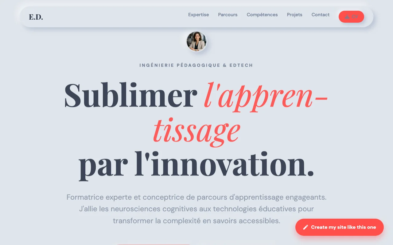
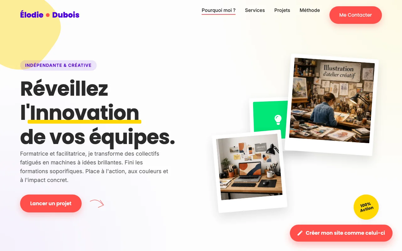
A trainer's website must do three things simultaneously: demonstrate the quality of your pedagogy, prove your professional legitimacy, and facilitate enrollment in your courses. Whether you're an independent trainer, a certified training organization, a teacher in transition, a pedagogue, an instructional designer or an e-learning creator, the challenge is the same: a potential buyer wants to know within 30 seconds whether your training fits their needs.
The essential elements: a "Courses" page structured by theme with, for each course: learning objectives, target audience, prerequisites, duration, price, format (in-person, remote, hybrid), and a clear enrollment button. Buyers compare; without this standardized information, they'll look elsewhere. Your certifications and accreditations: ISO 9001, ATD, accredited continuing education, software certifications (Microsoft, Adobe, AWS, Salesforce). For corporate or government funding, this is non-negotiable. Learner testimonials with their position and company, ideally with a concrete before/after ("before: I was coding in VBA, after: I manage a complete Python pipeline"). A "Methodology" section explaining your approach: active pedagogy, instructional design, materials used, assessment methods. This is what differentiates you from the trainer who just reads slides. A blog or free resources (articles, PDF guides, mini-videos) — powerful for SEO and demonstrates your expertise before purchase.
To avoid: a homepage that just says "I've been training for 15 years" without specifying on what; vague CTAs; the absence of compliant legal mentions.
Kyrlo generates your trainer website in 5 minutes from your course catalog or brochure.